Project Brief
As the world continually modernizes, the “digital divide” - a term describing disparity in access to technology - persists, placing certain groups at a distinct disadvantage. In particular, the recent global pandemic shed light on the inequality of digital access worldwide. Due to a substantial reliance on the internet for communication by a significant portion of the global population, individuals without access experienced even greater social and mental burdens during the pandemic. As a result, our team sought out to understand the varied digital equity landscape at the international, federal, and state levels through geospatial data analysis. In our project, we followed a set of guiding questions:
- What international metrics may inform digital equity in developed vs developing countries?
- Is there equitable access of ICT technology across the United States?
- How does the digital divide persist in rural vs urban areas at various scales?
A large part of the conversation about resolving the digital divide focuses on Information and Communications Technology (ICT) as well as telecommunications availability. As a result, we selected our main data source - a cell tower location database provided by OpenCellID. Managed by Unwired Labs, this collaborative initiative aggregates data from registered contributors.
Exploratory Analysis
In our exploratory analysis, we created over a dozen data visualizations to evaluate cell tower data at the international, federal, and state level. These visualizations condensed over 200 million data points into comprehensible and actionable information. Here are a few visualizations that I contributed to the section I lead, the international cell tower coverage section:
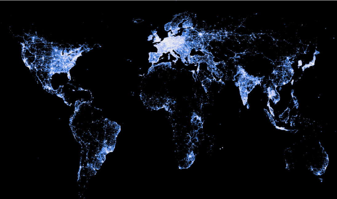
This map is a product of big data wrangling and data shading/condensing, and provides an overarching understanding of the cell tower coverage across different countries and regions.
In this interactive chart, we can analyze different countries’ advancement in cell tower technology with respect to their population, GDP per capita, and cell tower per capita. Interact with the chart by selecting sections of the scatter plot to see counts of countries’ dominant tower types (only GSM, LTE, UMTS), or click on each of the dominant tower types on the bar plot to see only countries of that tower type. The size of the countries’ populations are also represented through the size of the points, which you can hover over to find the country name. Note that GDP per capita and cell towers per capita on the scatter plot have been logged. Click the arrow above the charts to unfold the code.
The accompanying chart reveals not only a correlation between the logarithmic representation of cell towers per capita and GDP per capita but also a discernible trend. Less developed countries, as indicated by the GDP per capita metric, tend to exhibit a dominance of less advanced tower types such as GSM (2G), in contrast to more developed countries that are more inclined to have UMTS (3G) or LTE (4G) as the type most prevalent.
Project Outcomes
This project and its code has been posted on the MUSA 550 Fall 2023 website created by my instructor, Dr. Nick Hand. Find the full post of the Exploring Digital Equity project here.
In conclusion, our project successfully explored digital equity through cell tower data at multiple levels. The analysis not only provided a global understanding of technology distribution but also examined into the complexity of cellular landscapes in the United States and the challenges faced by rural areas. The project’s use of geospatial data science and analysis showcased the power of data science in uncovering patterns, correlations, and disparities related to cellular infrastructure. Ultimately, the findings contribute valuable insights to the ongoing conversation about bridging the digital divide and ensuring equitable access to technology on a global scale.