
Project Brief
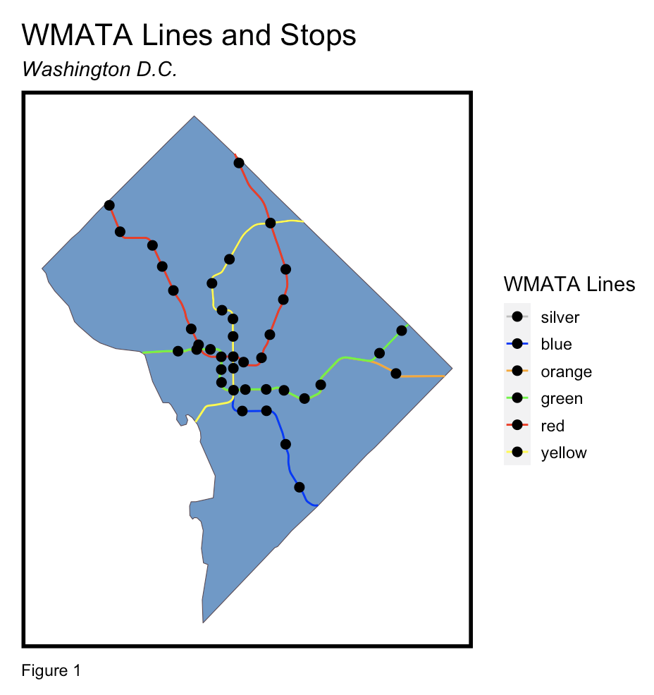
This project is an analysis of demographic changes due to transit-oriented development using GIS data visualizations. Specifically, the analysis aims to understand the benefits and impacts of Transit-Oriented Development (TOD) in the city of Washington D.C., with consideration of spatial biases. Using open data on Washington Metropolitan Area Transit Authority’s (WMATA) transit stops and lines, the analysis centers around benefits and potentials of TOD in the city. Some key things to keep in mind about this analysis: DC’s metro lines and stops have changed between the dates of the analysis. However, due to the lack of data on the 2009 stops, this study only uses the most recently published publicly available data (May 2023) for these stops.
Exploratory Analysis
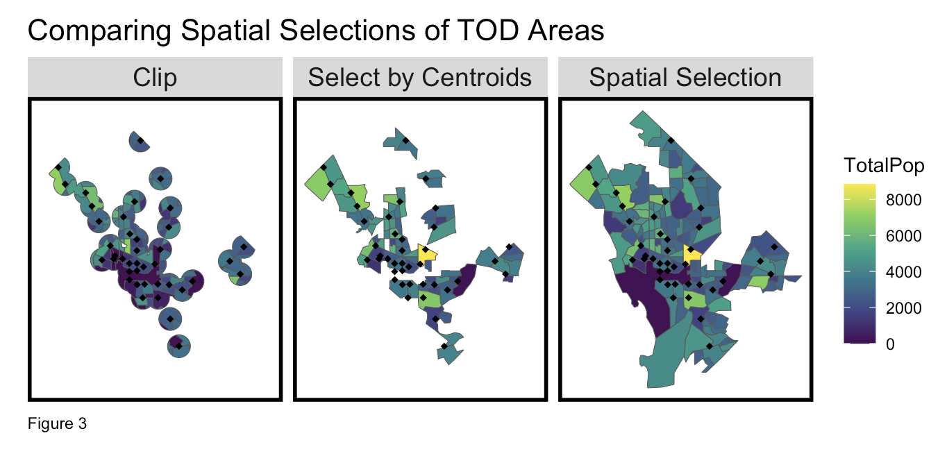
Firstly, TOD areas were identified using various spatial selections of regions relating to a half-mile buffer around exisitng WMATA transit stops. After comparing three possible spatial selections, the below “select by centroids” method was selected as a the most effective means of identifying TOD areas which each stop is likely to reach.
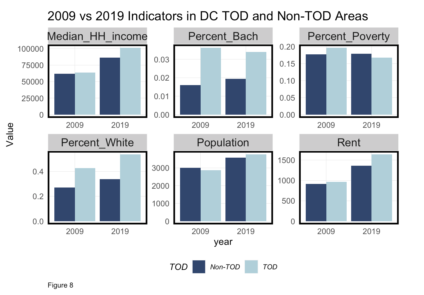
The project then conducted an analysis with feature engineering on a range of variables to analyze the impacts of TOD areas on those variables between 2009 to 2019. Specifically, the following census bureau variables were evaluated:
- Total Population
- Median Household Income
- Median Rent
- Percentage White
- Percentage with Bachelors
- Percentage in Poverty
These variables were then analyzed both non-spatially and in the contexts of TOD areas.
In the following selected maps, the shaded white areas are the TOD-classified areas.
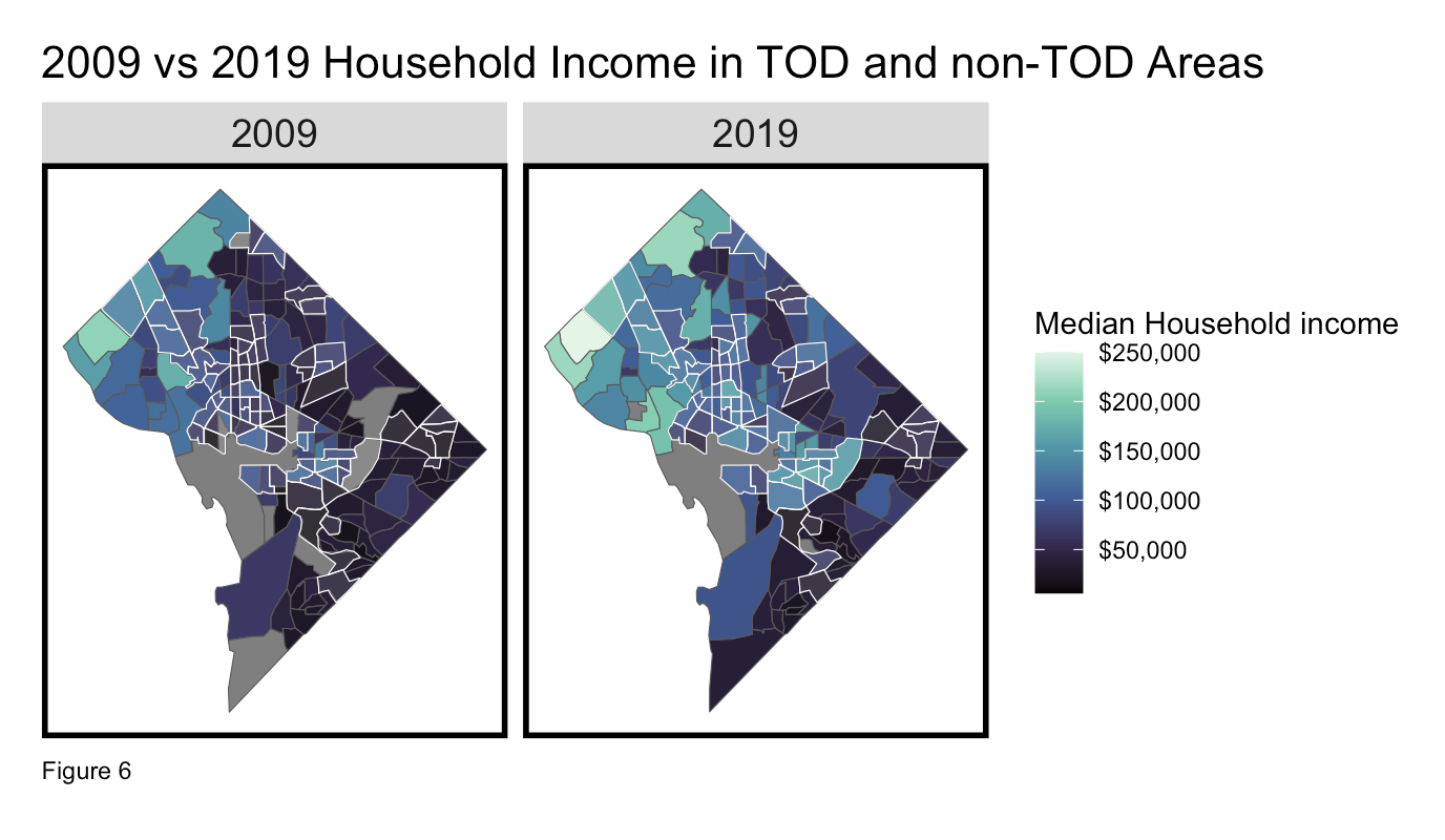
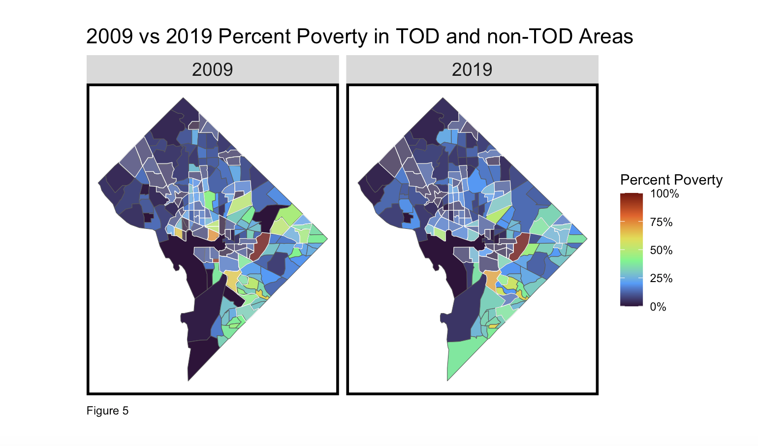
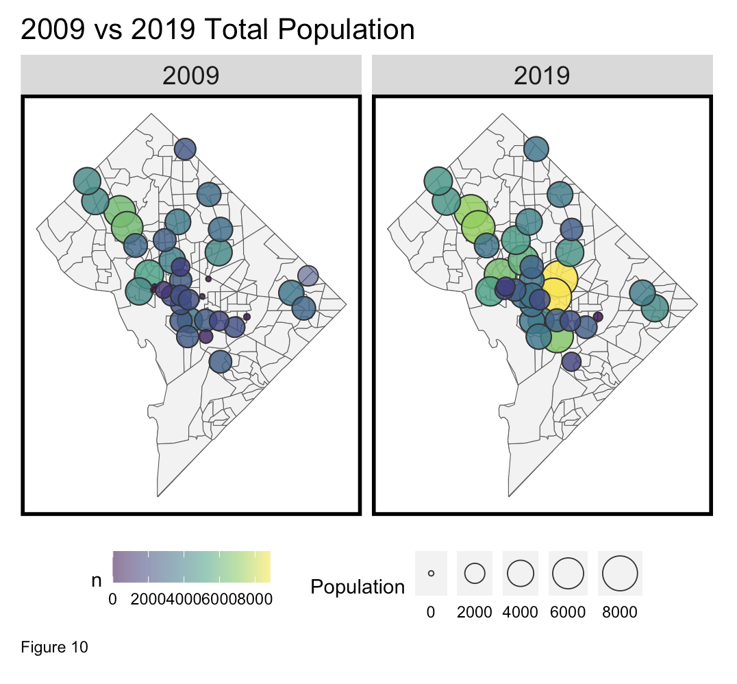
In the analysis, these variables and more were visualized across TOD vs non-TOD areas by creating comparative spatial analyses across time. Ultimately, the key takeaway regarding TOD was the impact of TOD areas on attracting affluent households with higher median rents.
Project Outcome
Click the full analysis button at the top to view at full screen.